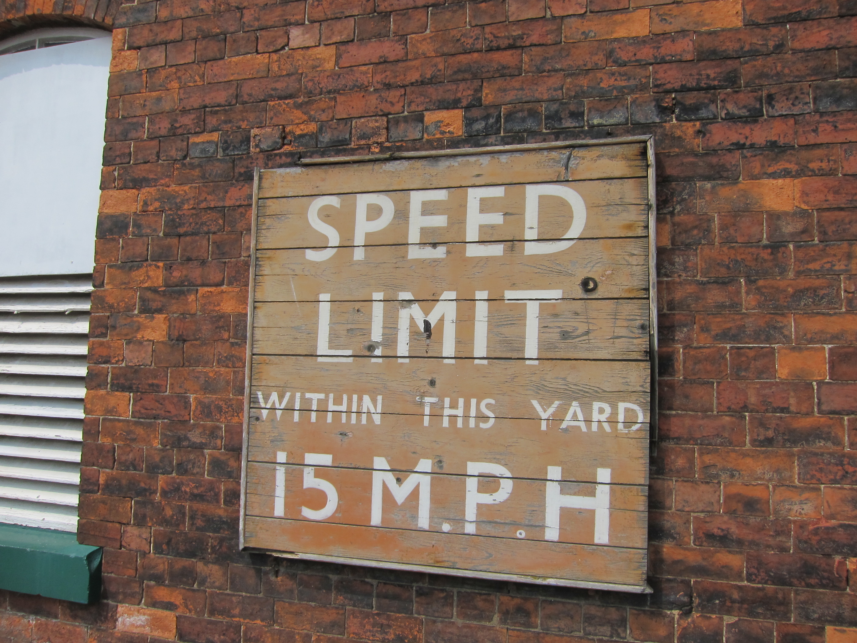
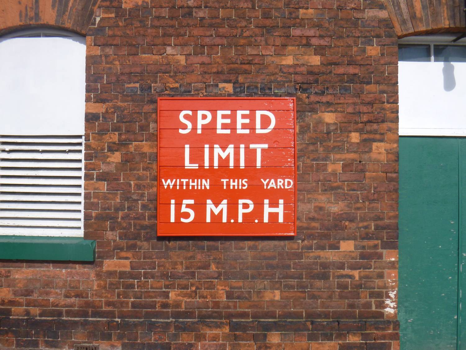
If you’ve arrived here recently via our City Entrance (the one nearest the railway station), you’ll have noticed a newly restored sign just outside our front gate.
This sign is believed to be original, and in place since the late 1940s. But after so long exposed to the elements, it deteriorated to a condition where work was needed to conserve it for the future. The woodwork was becoming unstable and the paint badly faded or peeling.
Interestingly, the sign was still an orange colour (known as “Tangerine”) that was used by the North Eastern Region of British Railways after nationalisation in 1948. Although this colour scheme was eventually superseded, it seems to have survived in this state until the present day.
The sign was removed from the wall and taken to the Conservation paint studio. Here it was carefully cleaned down and fully assessed, and a plan was drawn up for the work to be done.
It was realised that we’d need to replace the entire outer frame because the original was beyond repair, and repaint the sign back to original condition. We also decided that we should trace off the original lettering so that it could be replaced exactly as it was, making it as faithful to the original as possible.
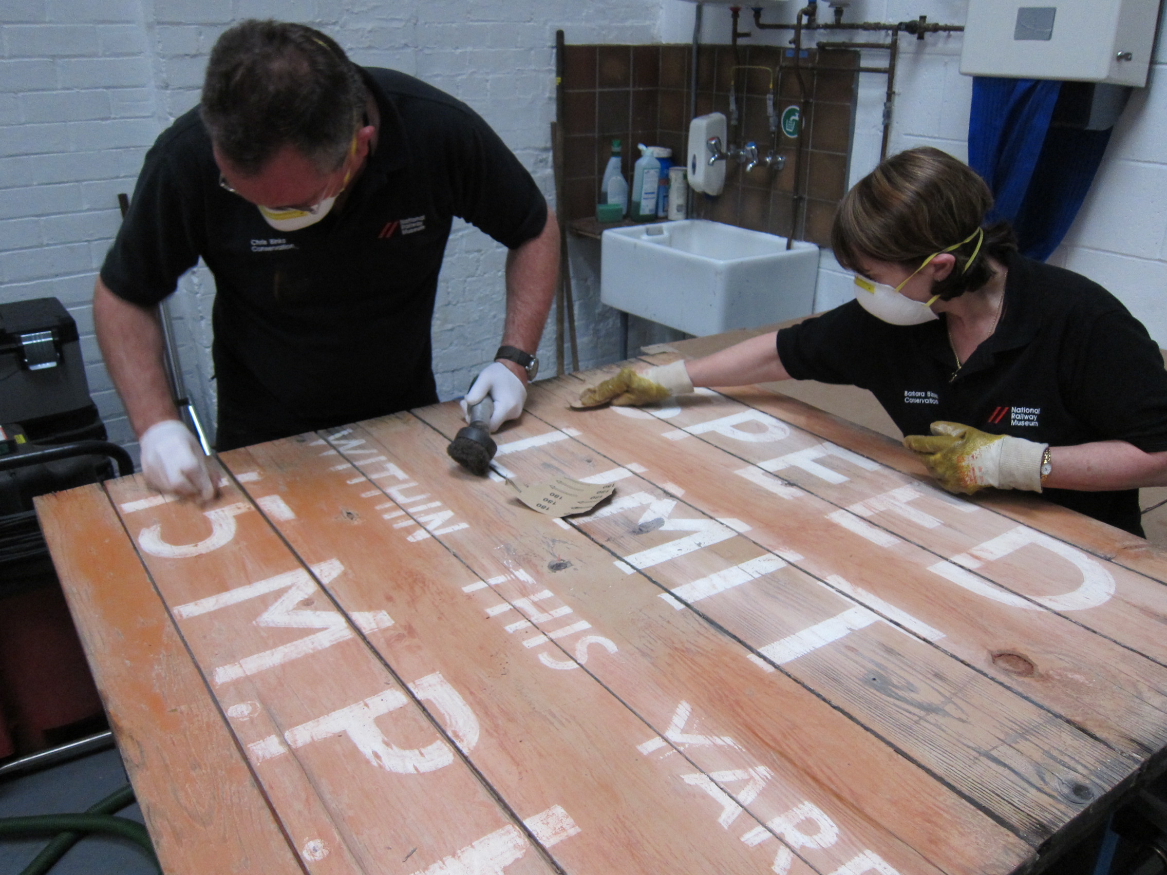
The next stage was for Barbara and Chris to gently sand down the sign in preparation for painting. This process is important as it allows the new paint to adhere properly to the surface, giving it a long lasting finish.
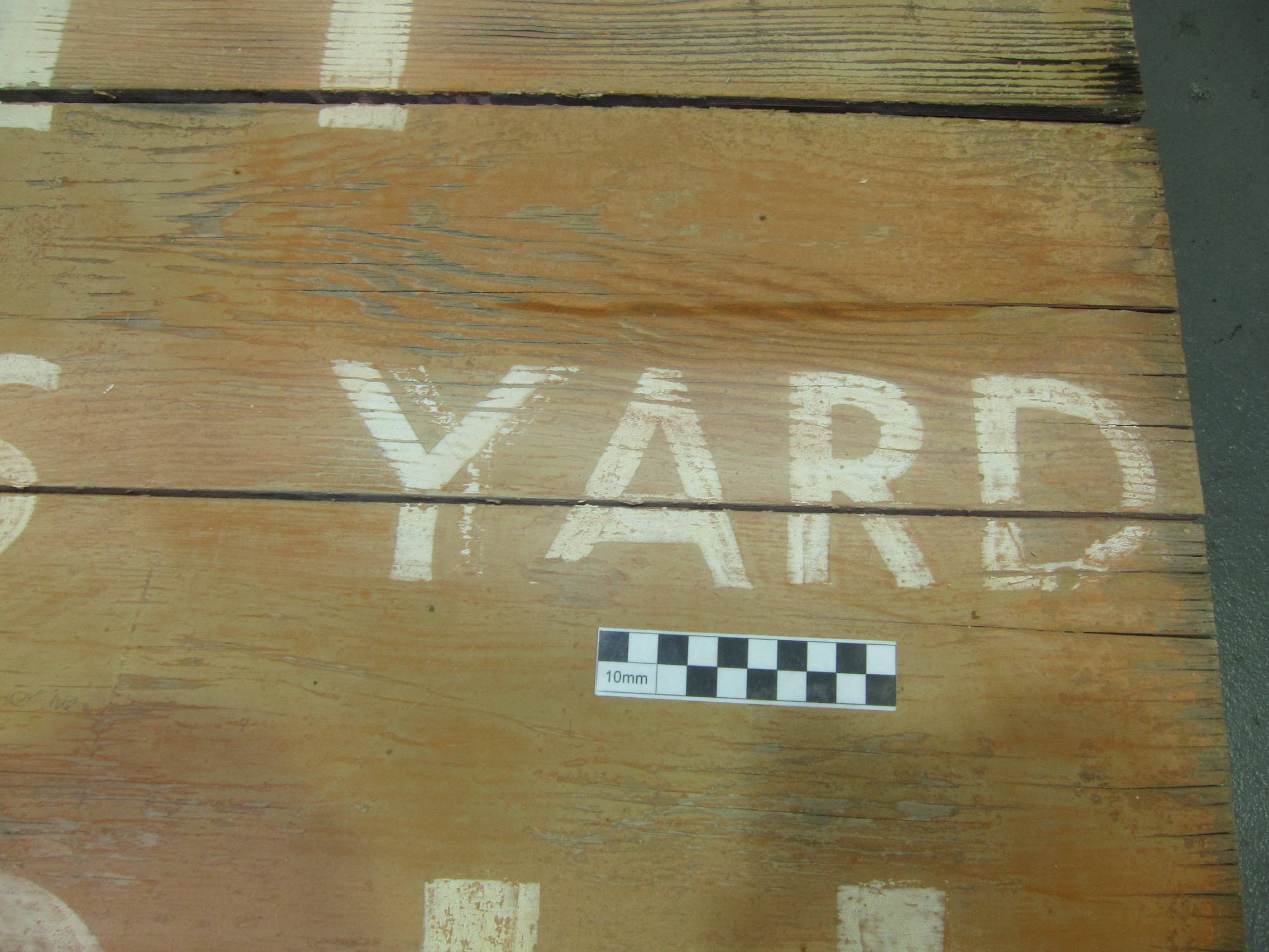
However – as the sign was sanded, we found that it had already been repainted once before, and that the lettering was slightly different underneath. The font was the same throughout the sign except for the number 5, which on the earlier version was more angular. But the spacing between letters was different on nearly all the words. All the new findings were photographed for future reference.
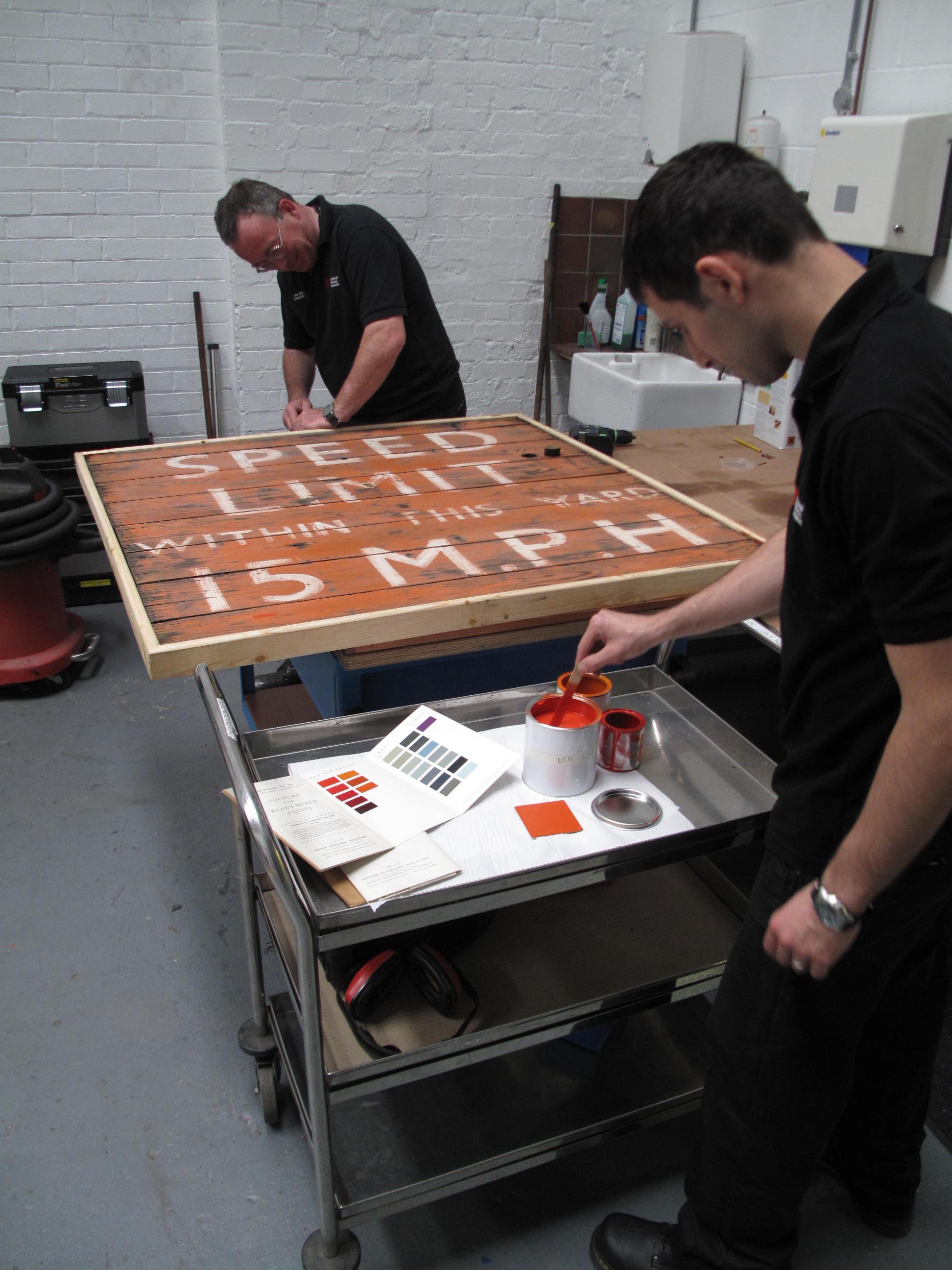
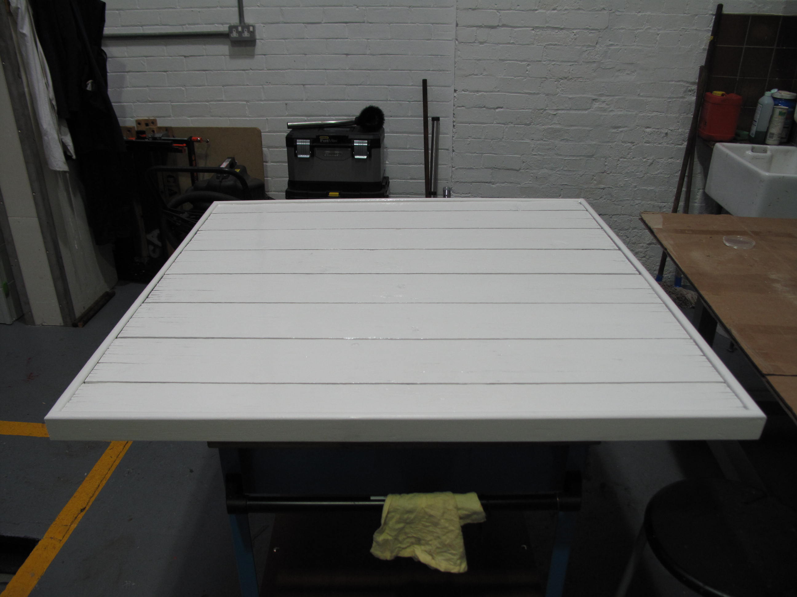
A new outer frame was constructed by Peter and Chris and attached to the sign, along with a new rear support to ensure the sign would not flex in the future. During this phase of the work the new paint was hand mixed by Stathis to ensure it was as close a match as possible to the original sign.
Once all the physical work was complete, the sign was given several coats of wood primer and undercoat before two top coats were finally applied.
The next stage was to carefully mark out the new lettering using the original tracing, before signwriting the wording back onto the sign. No masking tape was used, just a steady hand and a mahl stick (a painter’s stick with a soft end used as a support). As an experiment, the team set up a camera and filmed Andy applying the lettering: you can see the speeded-up result below. The three minute video shows 2.5 hours of work.
The sign was then allowed to fully dry before two coats of varnish were added to protect it. After a couple more days curing, the sign was finally taken outside and re-hung on the wall outside the museum, much to the satisfaction of the team.
Strangely for a BR (North Eastern Region) sign the font is not Medium Gill Sans!
Conservation? Really? In what way has this sign been conserved? I see that the wood has been retained, but that was not ‘the sign’. ‘The sign’ was what you have sanded off and obliterated. This was a wonderful survivor which, for me at least, was so appealing because it was untouched, because it had not been repainted for many, many years, because it was not a museum exhibit but a surviving part of the original yeard. Yes, the sign was a bit tatty, but it was entirely legible, and it was REAL.
Decent restoration, perhaps, but a very poor decision to do what was done, in my view. Poor show.
I shall also be interested to see if the repaint is so legible in sixty years time…
The level of applied treatment on an artefact always generates debate as to whether the treatment is necessary, and to what extent the original material structure should be preserved. This is actually very encouraging: it demonstrates the vivid interest and passion that local communities have, and keeps the heritage movement going across the UK.
In this particular case, there were several factors that led us to restore rather than conserve. The foundation was already in a very poor state, having been exposed to the elements virtually without maintenance over the years. The wording is still in effect, and our aim was to maintain as much of the sign’s original structure rather than merely replace it, effectively placing it out of its context and function. Please note that this sign is not included in the National Collection – but we’ve created a conservation plan for it that takes conservation ethics into consideration.
We took special care not to ‘obliterate’ the original layers. On the other hand, an amount of sanding was deemed necessary to remove the compromised paint and create a stable foundation for a new paint scheme. The original layers (more than one) are still present underneath. The paint stratigraphy has revealed at least two previous maintenance phases – no surprise for a sign in use since the late 1940s! We did not attempt to correct the typeface (eg the angular shape of number 5 is not consistent with the Gill Sans typeface, the spacing between the words varies, and other details). Finally, we kept a detailed photographic record, part of which can be found in the blog post.
So we thought it pragmatic to maintain this artefact and prolong its life with respect to its original context and function: a railway yard sign destined to withstand Yorkshire’s somewhat harsh weather for many years ahead!
Interesting problem. If BR had still be in operation, it would just have repainted the sign as it had done before so arguably, the restoration process is just repeating previous efforts. Was it wrong for the sign to be repainted in the past ? Should every railway artifact be picked in aspic if it still has a use today ?
I can see the argument that the sign looked very nice and authentic in its faded state but as it turns out, it wasn’t “authentic” at all since it had been repainted already.
Whatever the case it is not a font, but is clearly based upon Gill Sans. Fonts are something for mechanical composition, not for hand lettering. Those who did the lettering would have taken Gill Sans as a model and then made their own version of it. The spacing would be a matter of personal judgement, not based on a typeface. Monotype never produced Gill Sans at this size, and the wood letter versions, can be significantly different depending on the manufacturer
I think that the best thing to do would be save the original sign as is, and make a new sign where it was in the same style, then no one could complain that the sign was deteriorating whilst the original was saved and its condition maintained. Unfortunately the restored version seems to have lost the charm of the original lettering, the handling of curves in the original were done with some skill, which seems to have been lost in this version. Just ‘tracing’ lettering seems to have led to a large amount of unnecessary crudity.
Its incorrect to use the British Rail analogy as its gone from being part of a active modern railway operation to being part of collection of archival material and should be preserved as is.
In all a well meaning effort, but to me it should have been done differently.
I totally agree with you, it’s not a bad effort but an over done amateurish effort to be honest which won’t last 5 mins. I’m always wary of “signwriters” that work flat & take a long time, I would of knocked a basic no fuss job such as this on my easel upright in no more than an hour , with a spot of silver in my white to ensure that it “covered in one”
Do you have the official RAL colour code (or similar) for the tangerine orange of the sign? Looking to get some mixed for my own project and want it to be as authentic as possible.
Hi
I have a metal network rail sign from “Radipole Halt” that is beginning to fade. I don’t really want to paint it but what can I use to clean and what can I use to help reduce fade please?
Hi , big mistake varnishing the board as what protects the varnish?
The average life for exterior varnishing is relatively short these days & once it has broken down the sign then starts to look old & tatty & before long it will need repainting, it’s safe to say the board would not have been varnished back in the day . As a top skilled traditional signwriter I do not like or ever use fonts, these are computer & machinery derived letter types not for us signwriters but printers & “sticky letter boys” & the untrained amateur etc.
I’ve just watched the guy relettering the board, not a signwriter but a “filler inner”. No wonder it took so long, a good effort though for an enthusiastic amateur.